Summary
novative came from a unique challenge: branding something that didn’t exist yet. At the time, my master’s project was still in the research phase with no defined solution. So, for my Brand and Visual Design course, I pulled inspiration from what I was learning that fall—themes of transformation, intentionality, and wellness across diverse audiences with different needs and aspirations.
Rather than designing a brand around a specific tool, I built novative using insights from my master’s project—drawing from literature reviews, user research, and a comparative analysis of wellness products. The goal was to create a strong visual and verbal identity that could guide the future design of a solution. After four weeks, novative became a brand that captures self-reflection, progress, and intentional growth—something flexible enough to evolve while staying rooted in its purpose.
ROLE: Individual Contributor, Branding, Visual Design, Comparative Analysis
The Name
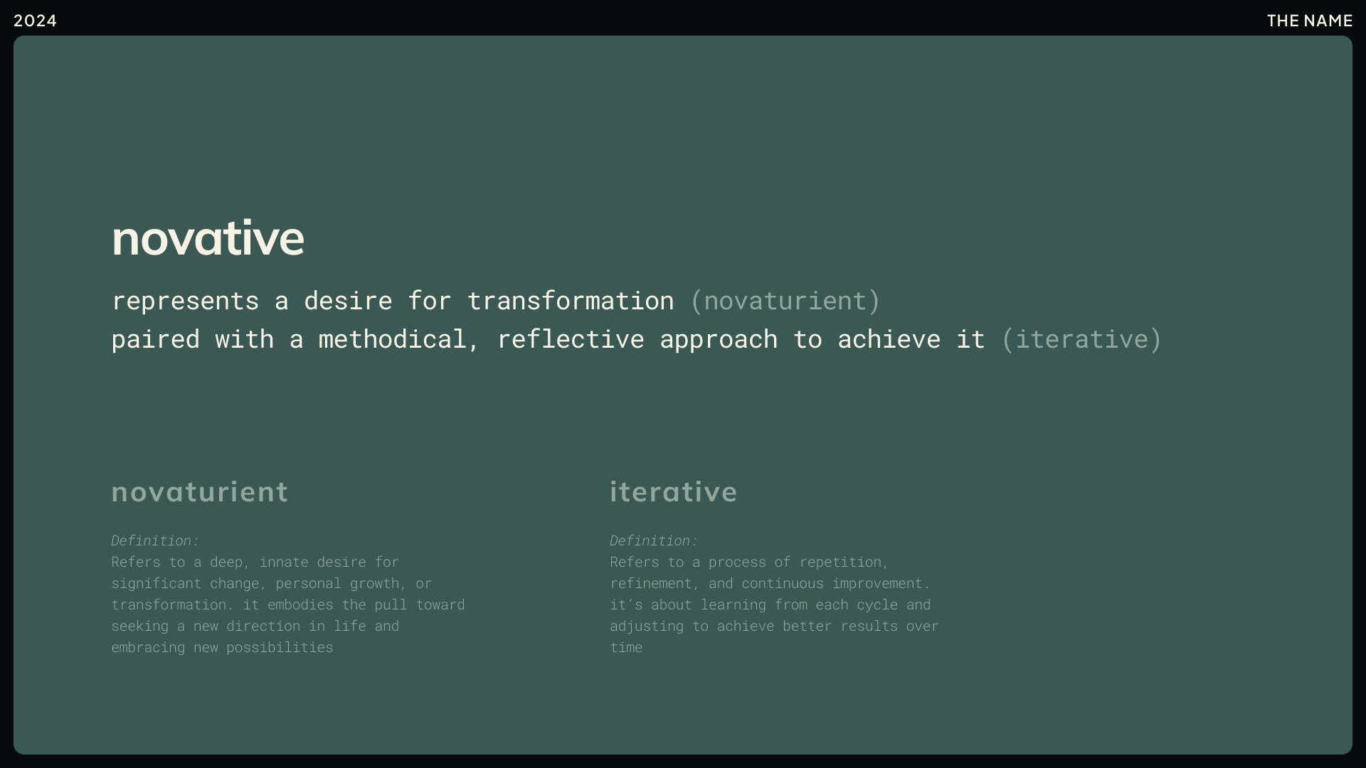
Choosing the right name was key to setting the foundation for this brand. Before landing on novative, I explored terminology across cultures—searching for words that captured transformation, self-discovery, evolution, and growth. I wanted a name that aligned with our master’s project goal: helping people navigate compassionate self-discovery and personal growth.
Through that research, I found "novaturient", a word that embodies the deep desire for change and new possibilities. I then merged it with "iterative", representing the continuous refinement at the core of the reflective iteration framework we were building toward. The result was novative—a name that reflects intentional progress, fueled by curiosity and self-compassion.
The Mission
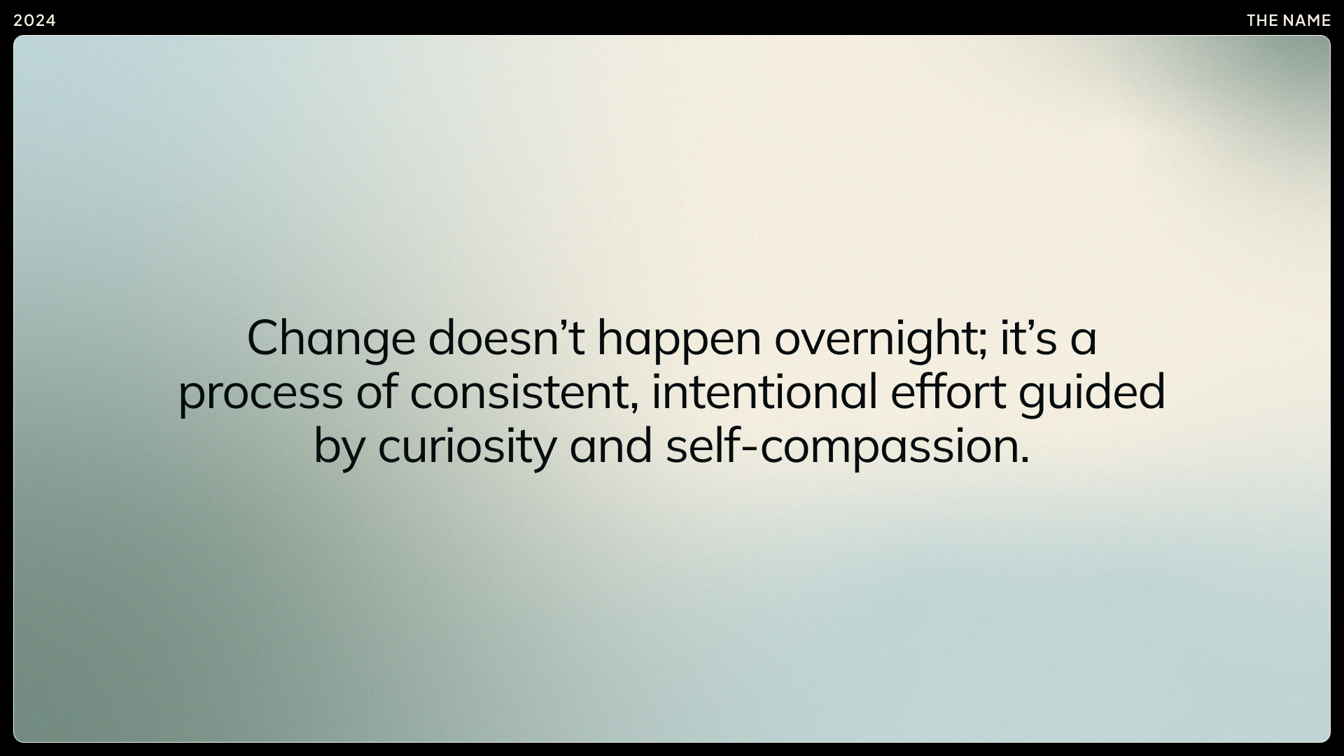
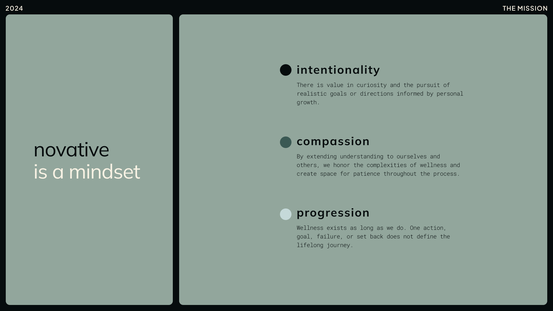
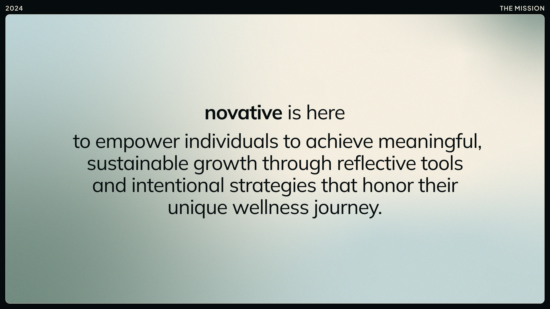
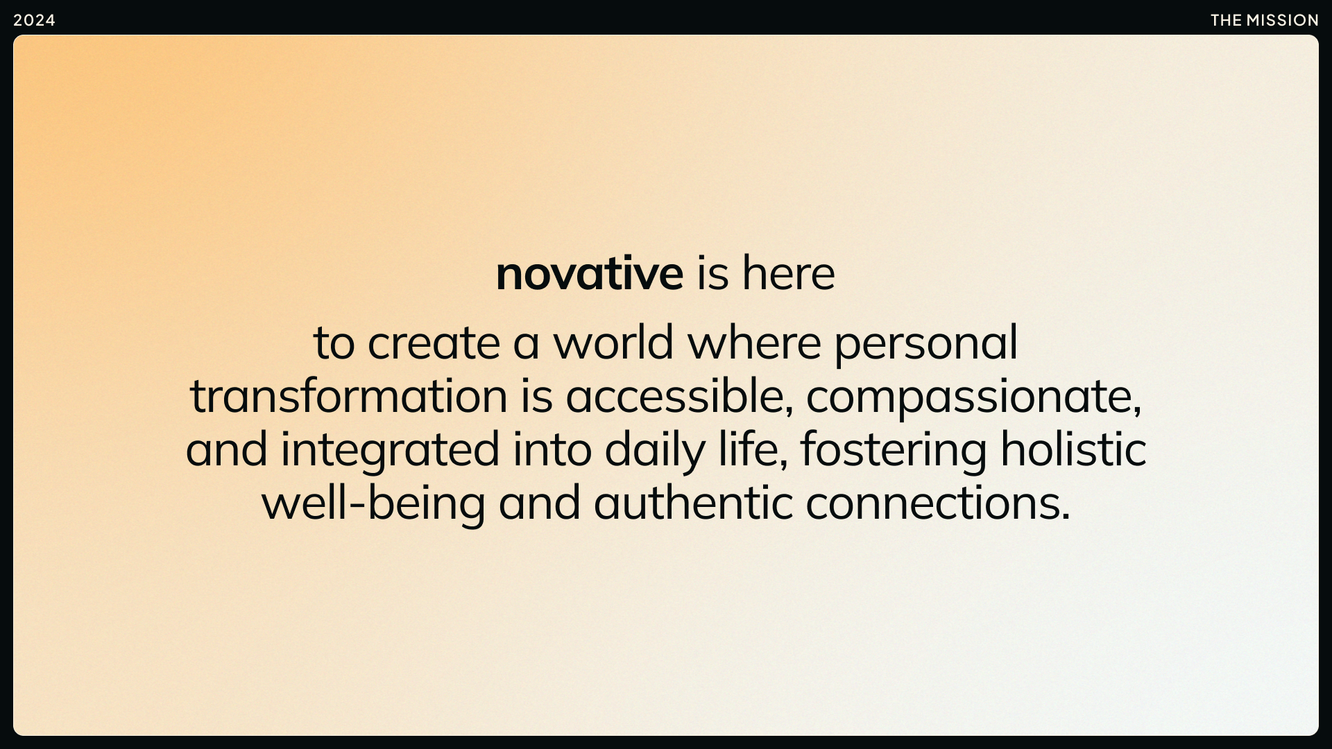
When defining the mission of novative, I wanted to clarify not just the brand’s value to potential users, but also how it could contribute to society as a whole. While this wasn’t required for the project, I saw the mission as a guiding pillar; something to keep us aligned as we moved from user research into design decisions.
This mission and vision were shaped by a comparative analysis of wellness technology and consumer products. I explored brands like Oura, Finch, Happy Things, How We Feel, Journey, TickTick, Gentler Streak, and more (over 40 of them!). Through this research, one theme stood out: wellness is a journey, not a destination. It’s about progress, not perfection—embracing personal growth through self-reflection, intentional action, and self-compassion along the way.
The Audience
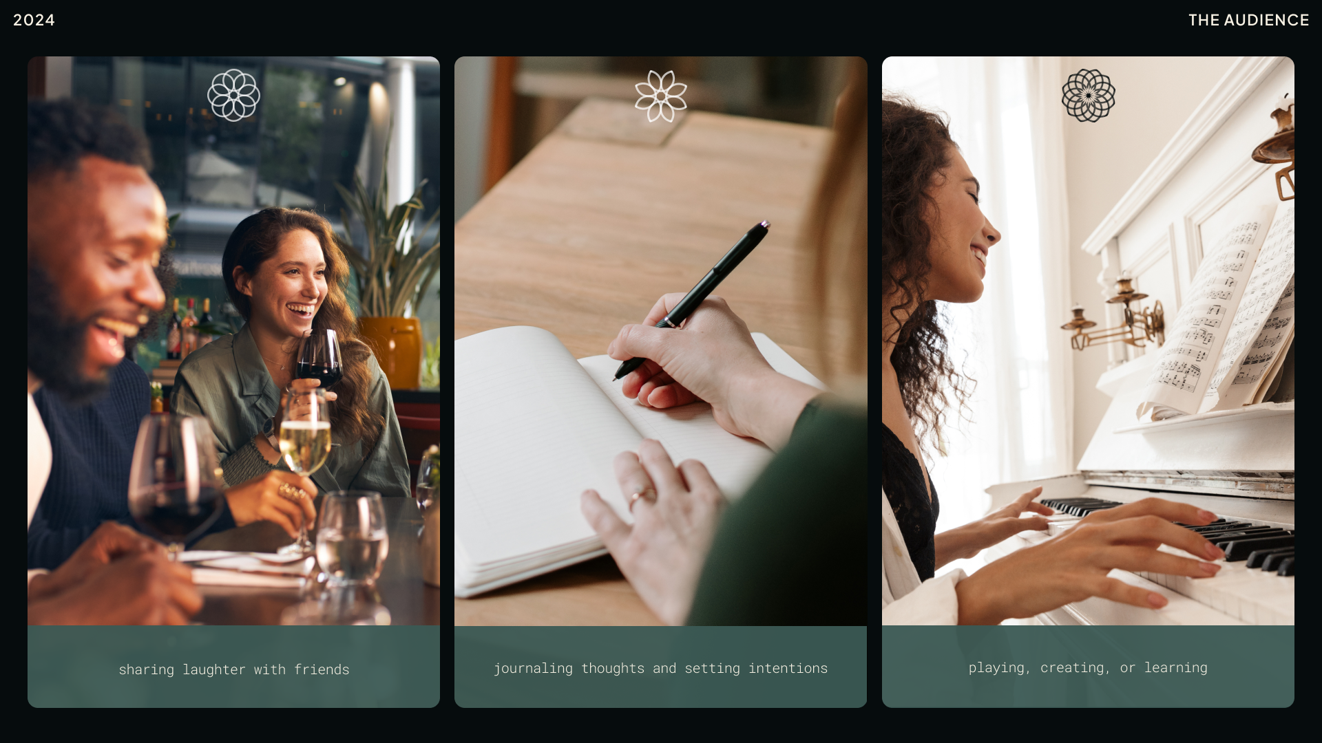
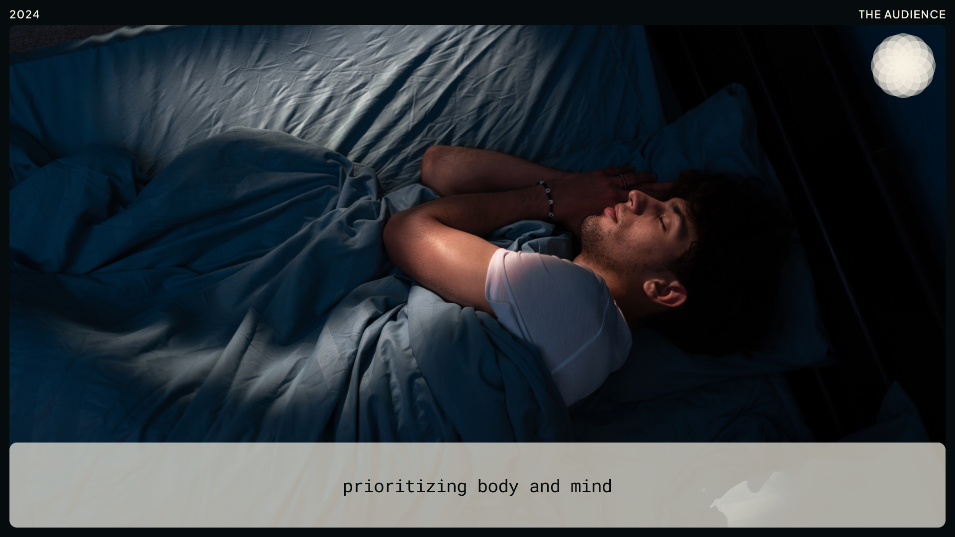
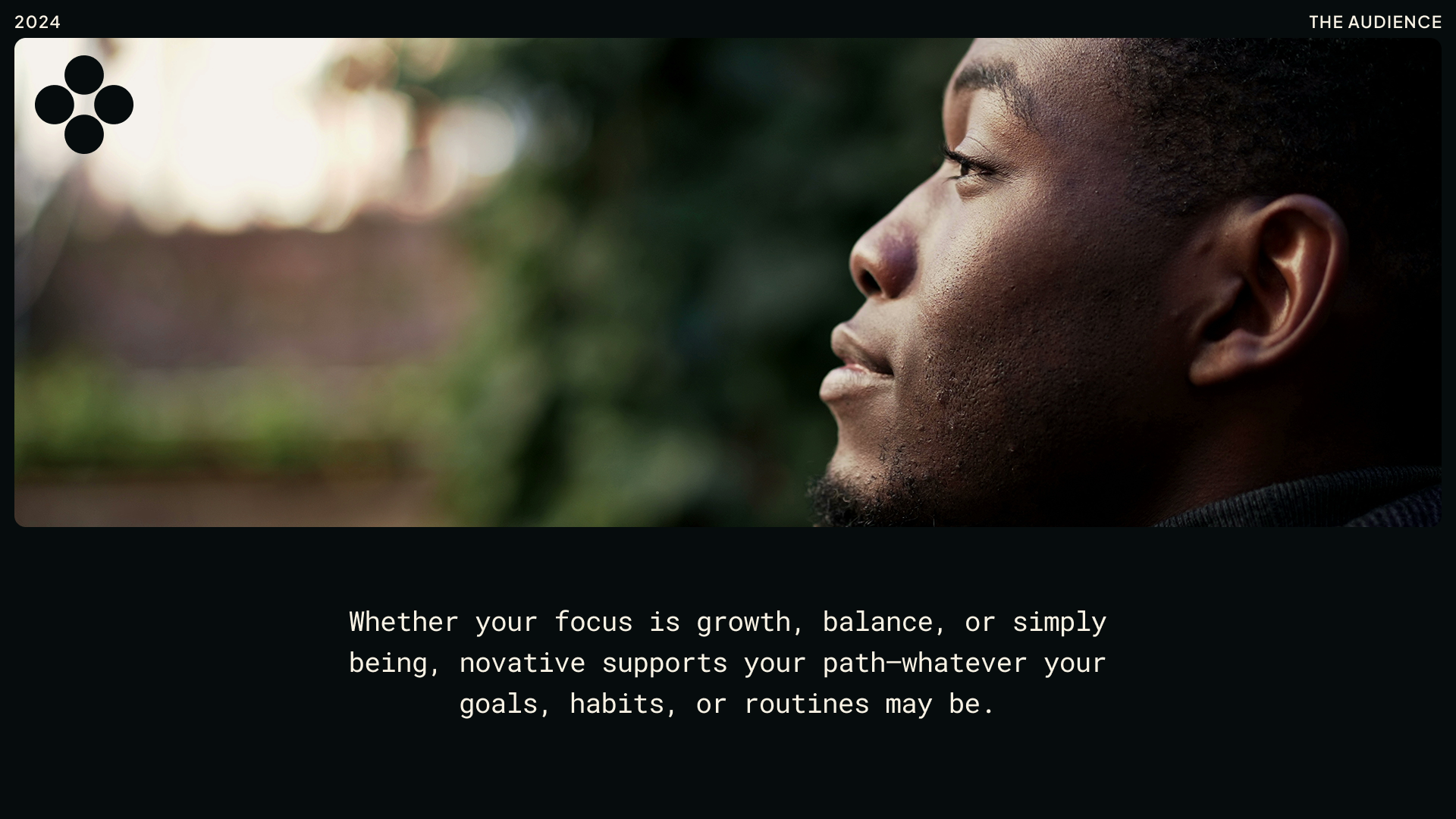
Defining the audience for novative came with a challenge—as a master's project team, we were still in the middle of that research. At the time, we hadn’t yet completed our user analysis, and even as I write this, that work is still in progress. Knowing both what I knew and what I didn’t, I focused on capturing what was true at the moment. The most compelling insight from our master’s project was that wellness is for everyone—and it can include almost everything. Our literature review expanded this perspective, showing that wellness isn’t just physical or mental; it exists across multiple dimensions (6 or more depending on the theoretical framework you want to align to).
Because of this, I had a unique opportunity to design a brand that could connect with a broad audience. Rather than focusing on demographics, I leaned into behaviors and emotions—things that people across different backgrounds could see themselves doing as part of their wellness routines. Whether someone is setting intentions, journaling, learning a new skill, or simply trying to balance mind and body, novative is designed to be flexible and supportive. It’s about meeting people where they are, no matter their goals or routines.
The Brand
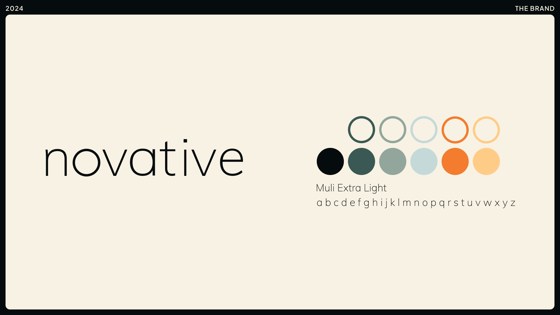
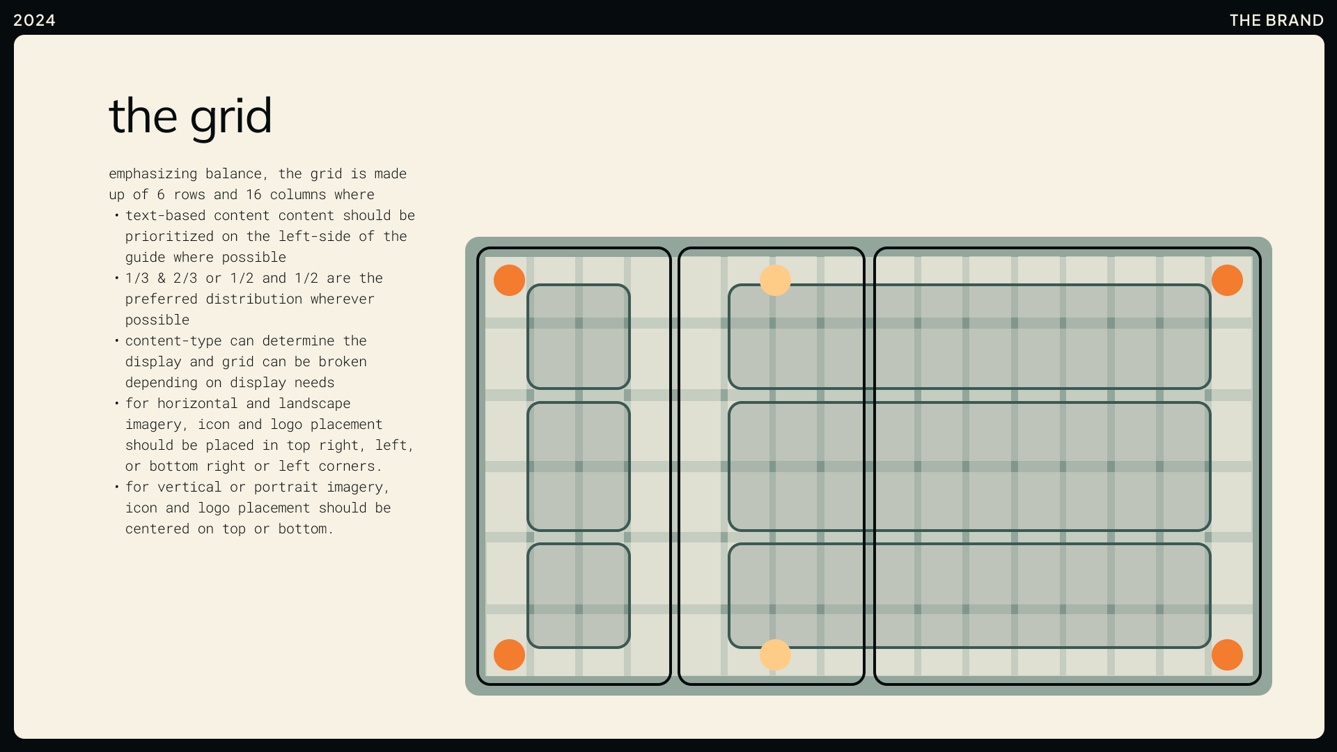
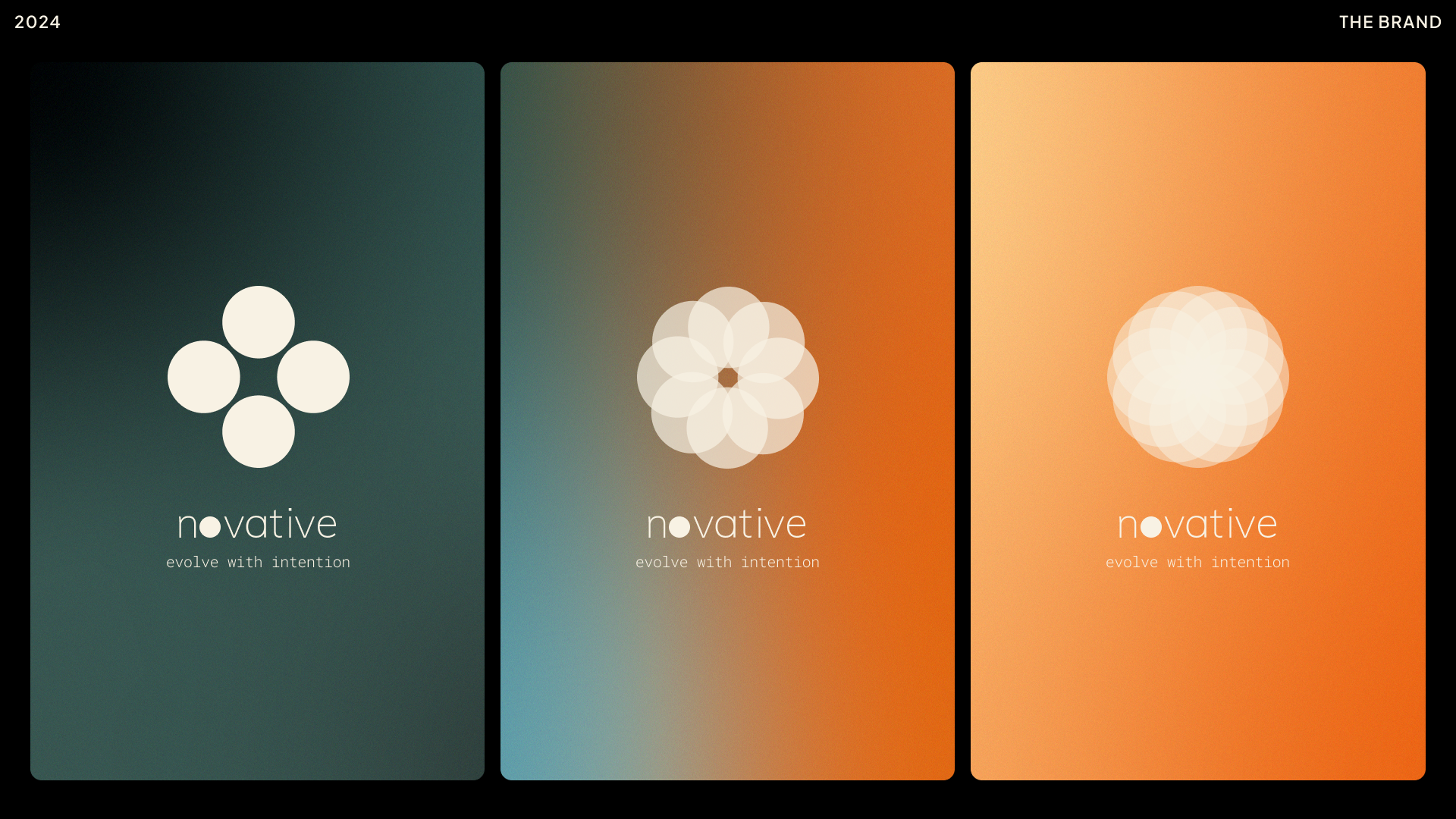
The novative brand system was designed to reflect balance, progress, and clarity—but more than that, I wanted it to feel adaptable. Because the brand wasn’t tied to a specific product, I had the freedom to explore a visual identity that could flex and evolve, just like the concept of wellness itself.
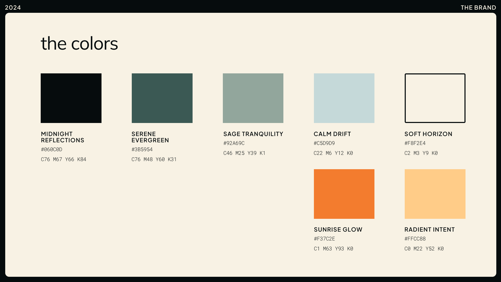
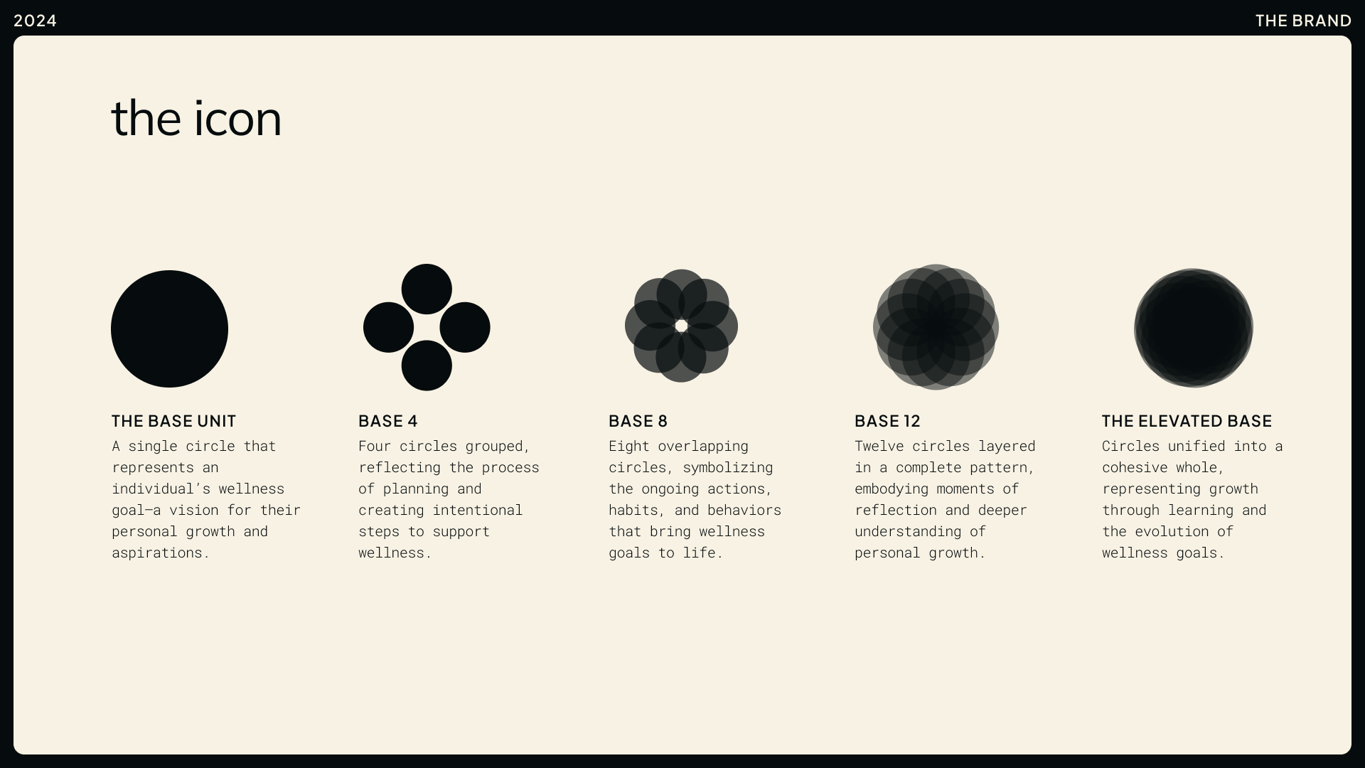
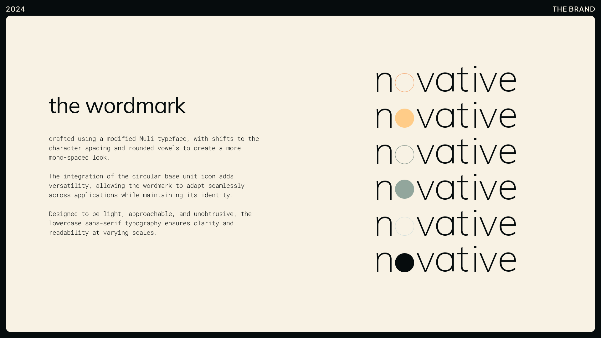
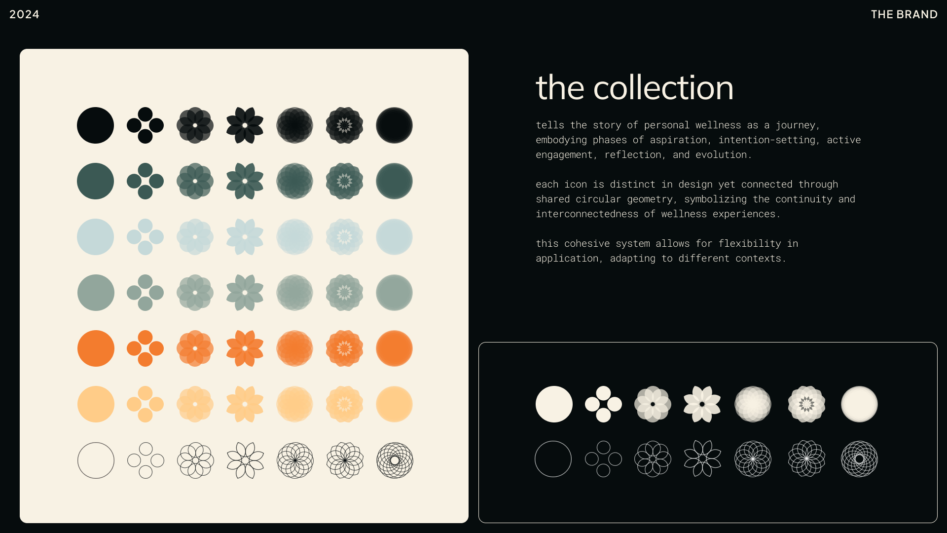
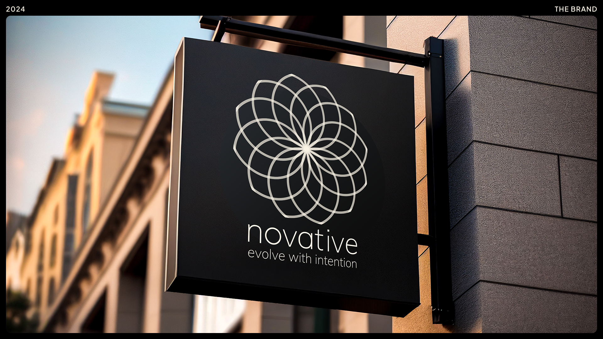
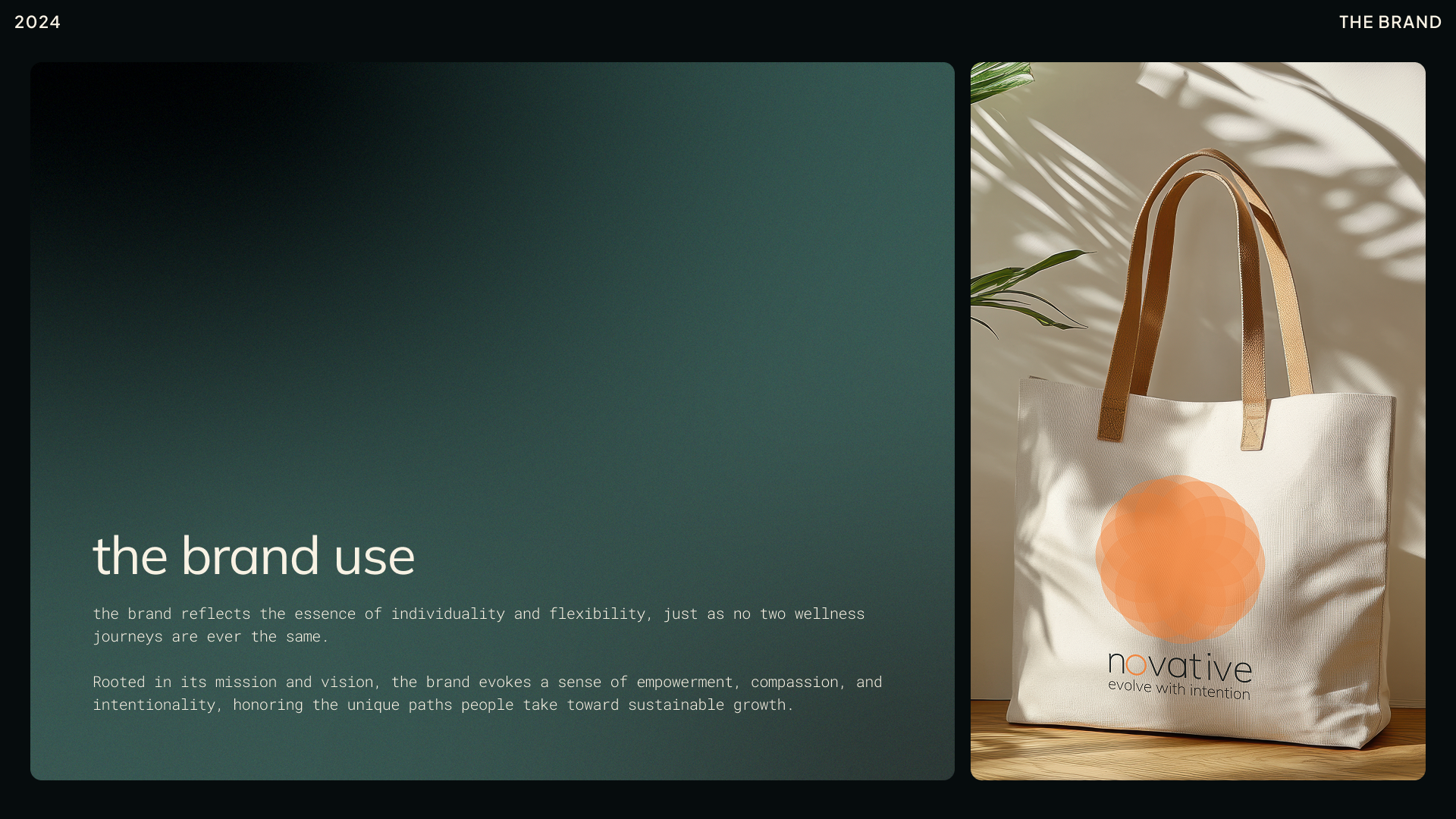
I built the system around structure and transformation, using a grid for consistency, a circular icon system to represent change, and a warm yet modern color palette to create a sense of approachability. Every design choice—from typography to iconography—was made with intention, reinforcing the idea that progress happens over time through reflection and iteration. The assets were designed to showcase the flexibility of the brand system and how it could be applied across different contexts.
Spring 2025 Reflection
The biggest challenge of this project was figuring out how to bring it to life without an actual product to anchor it. It almost felt like playing with an imaginary friend—something I knew was real but had no tangible form for others to see. Through this process, I realized how smaller elements—an icon, a color, a grid—when used consistently and with intention, could create something recognizable and meaningful. These design choices helped shape the silhouette of something that didn’t fully exist yet.
This project reinforced what I’ve been learning in my branding courses: branding isn’t just about something visible or tactile—it’s just as much about feeling. A strong brand evokes emotion, making people think, "I connect with that." "I resonate with that." "I want to feel that." Done well, branding creates an experience that extends beyond a logo or a product.
Because this was done in the thick of our master's project research phase, it gave me the freedom to explore what connecting on the "feeling" side of design meant. It also gave me an early sense of how our master’s project could eventually manifest. Now, as we enter the mid-fidelity prototyping stage, we’re still too early to fully apply these design elements—but I’m already thinking about how to bring this tone into our user testing. And what’s been especially rewarding is seeing early concept testing validate some of the ideas I explored in this branding assignment.
This project didn’t follow the usual research → design → test → refine → polish process. Instead, it was an experiment in shaping something abstract into something tangible—a creative challenge that ultimately gave me a clearer vision of what could come next.
